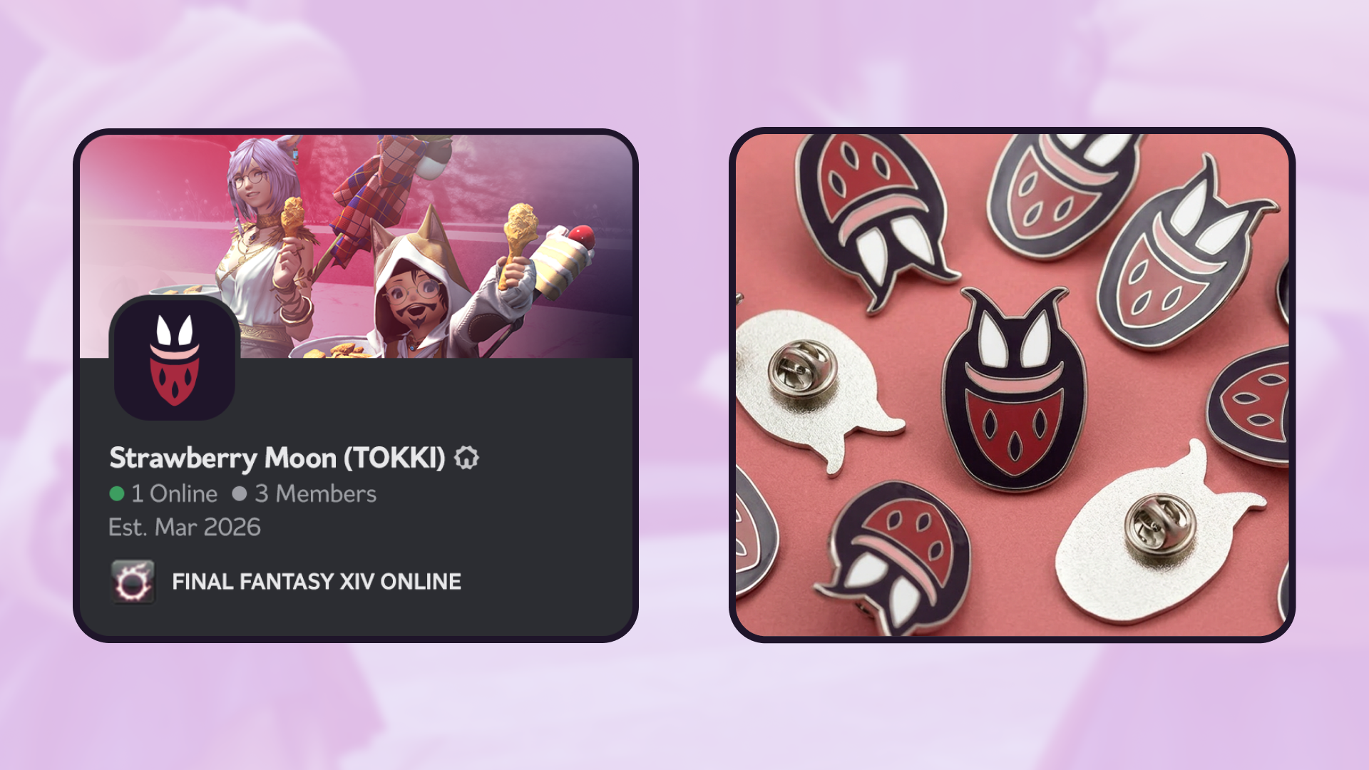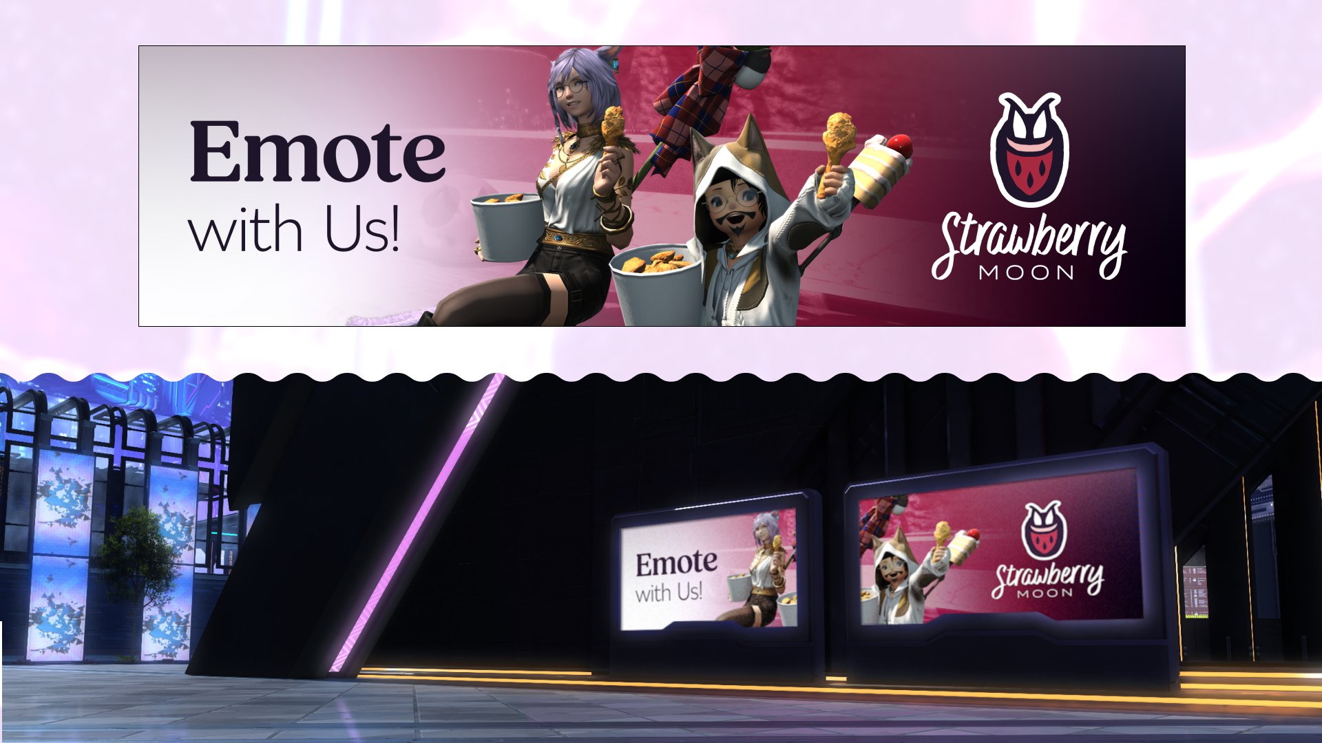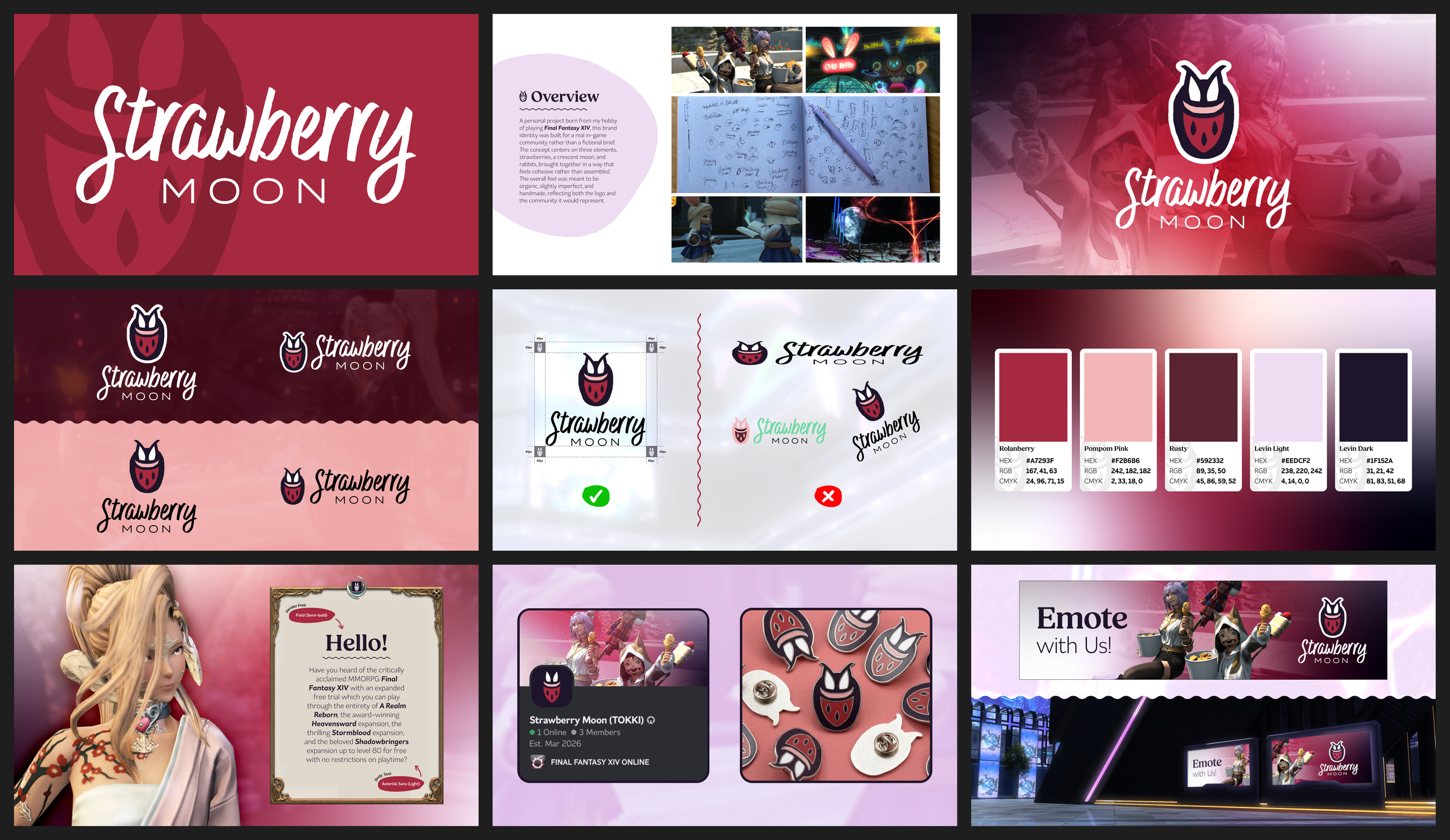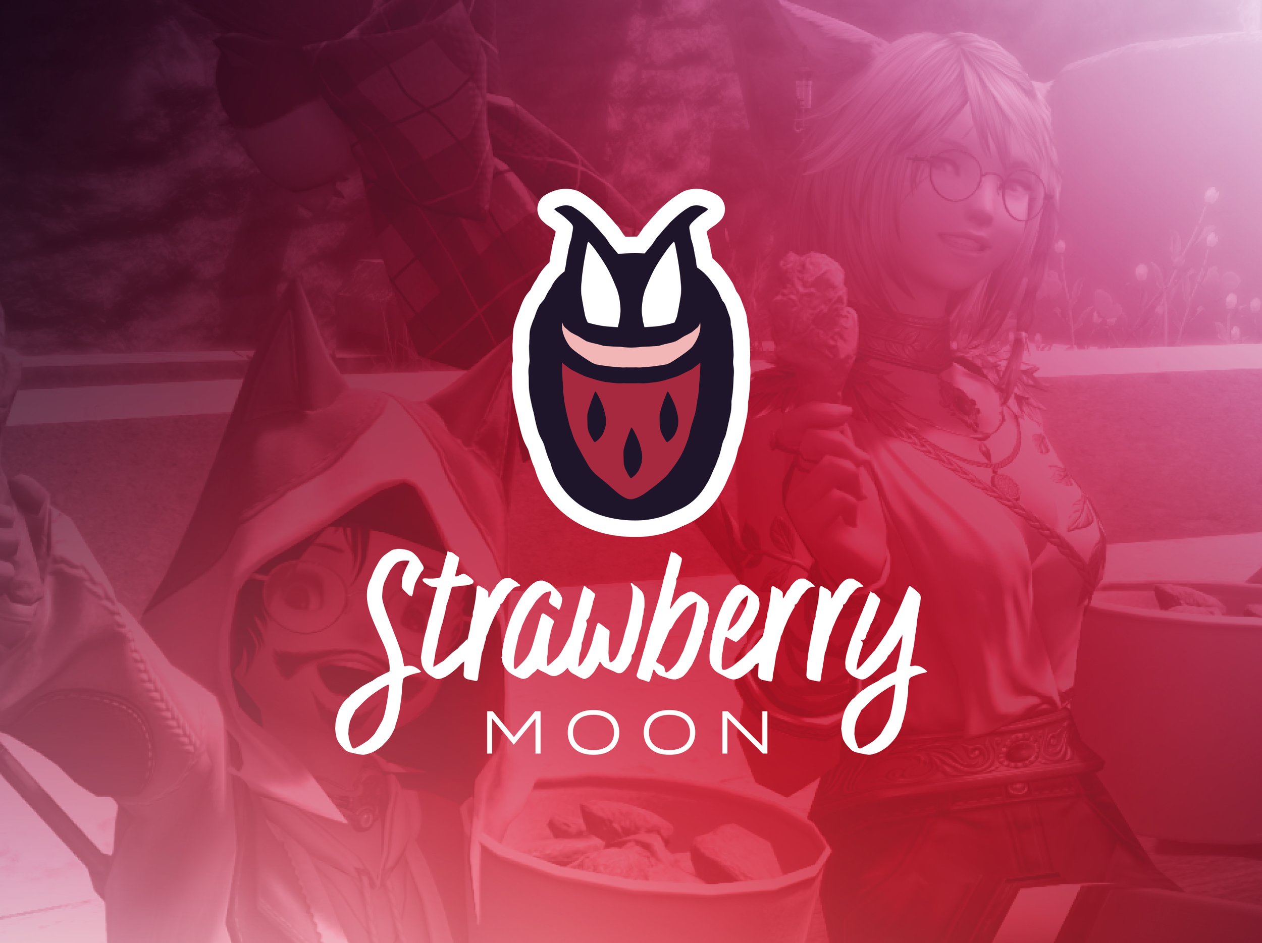
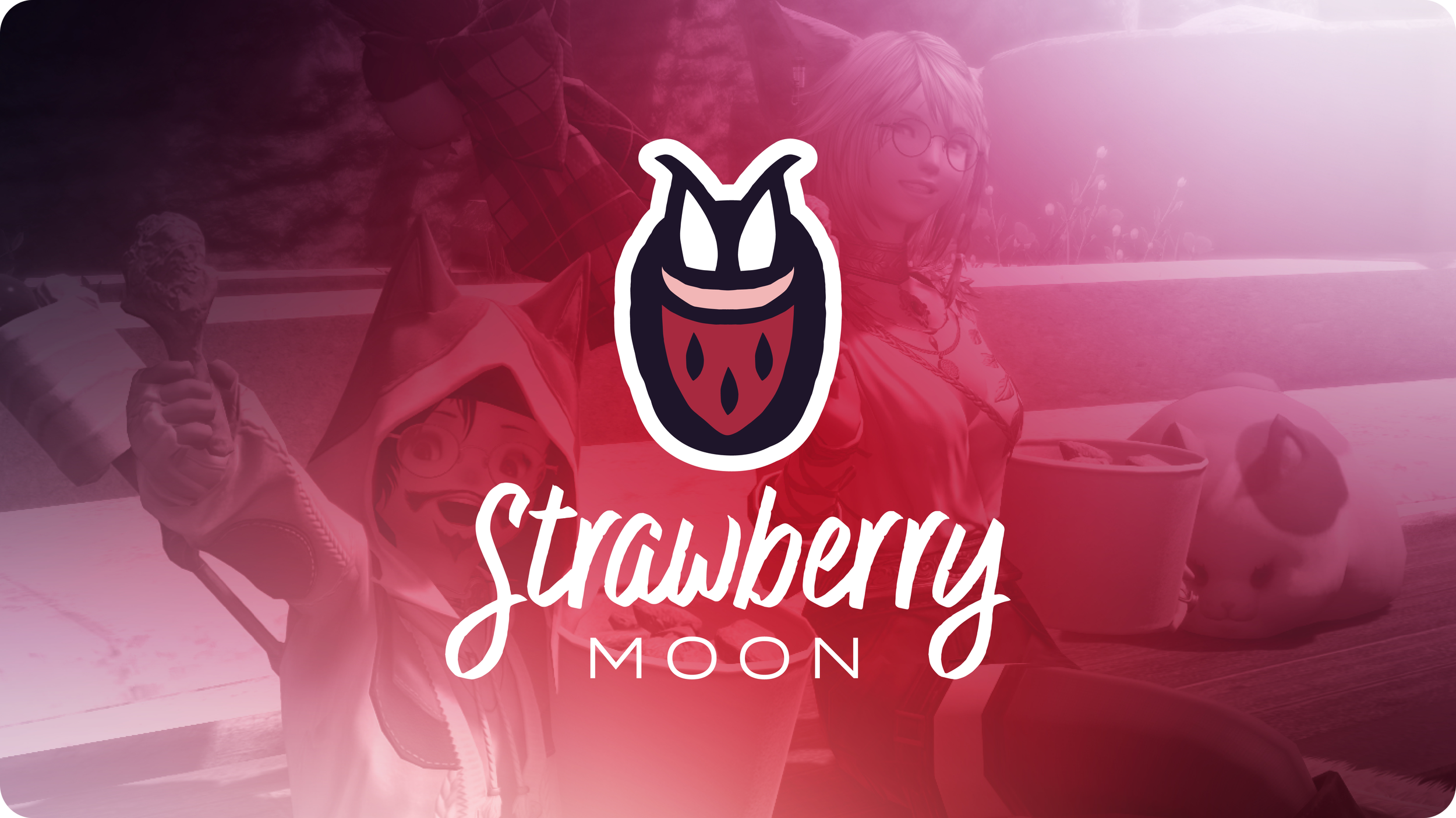
Strawberry Moon
My Role: Logo Design, Brand Identity
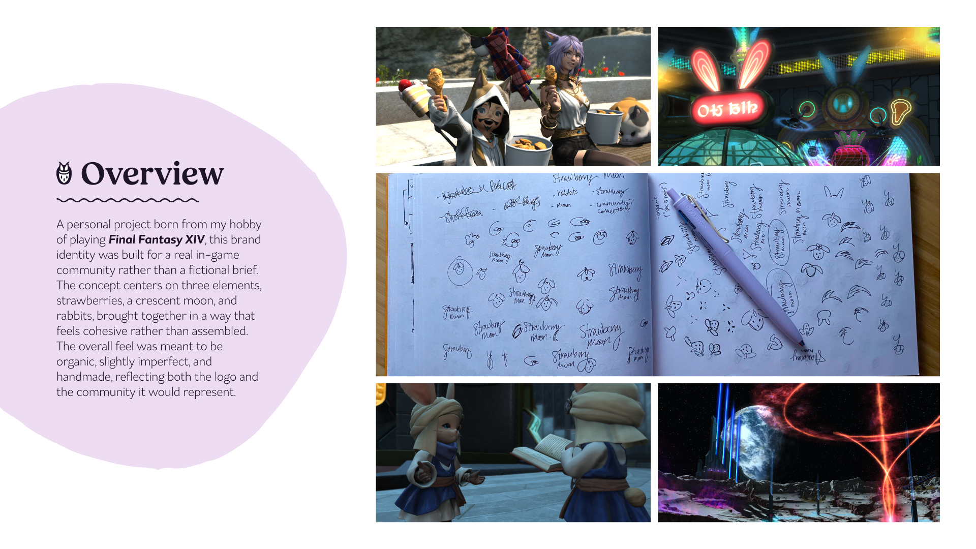
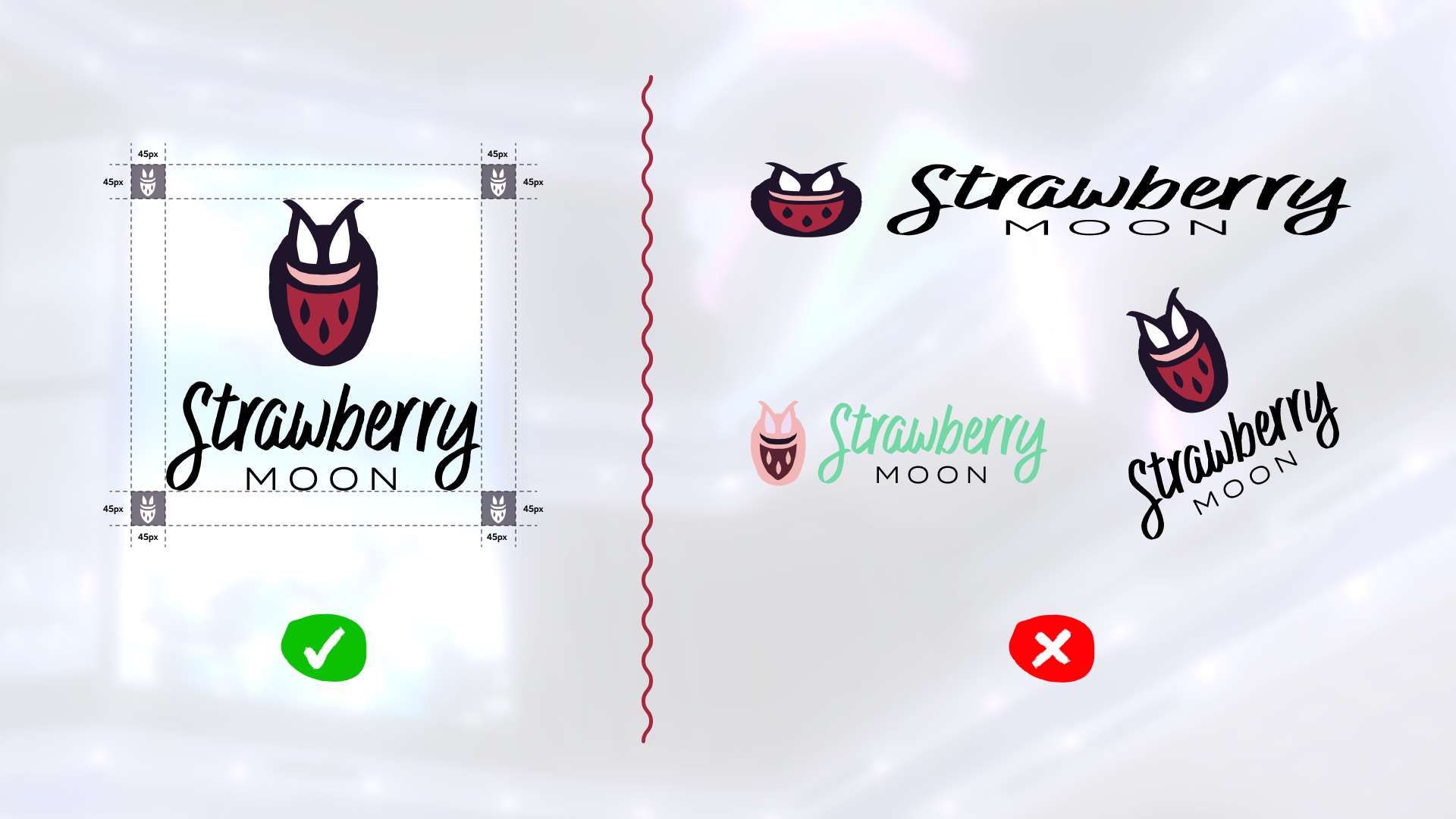
A personal project born from my hobby of playing Final Fantasy XIV, this brand identity was built for a real in-game community rather than a fictional brief. The concept centers on three elements, strawberries, a crescent moon, and rabbits, brought together in a way that feels cohesive rather than assembled. The overall feel was meant to be organic, slightly imperfect, and handmade, reflecting both the logo and the community it would represent.
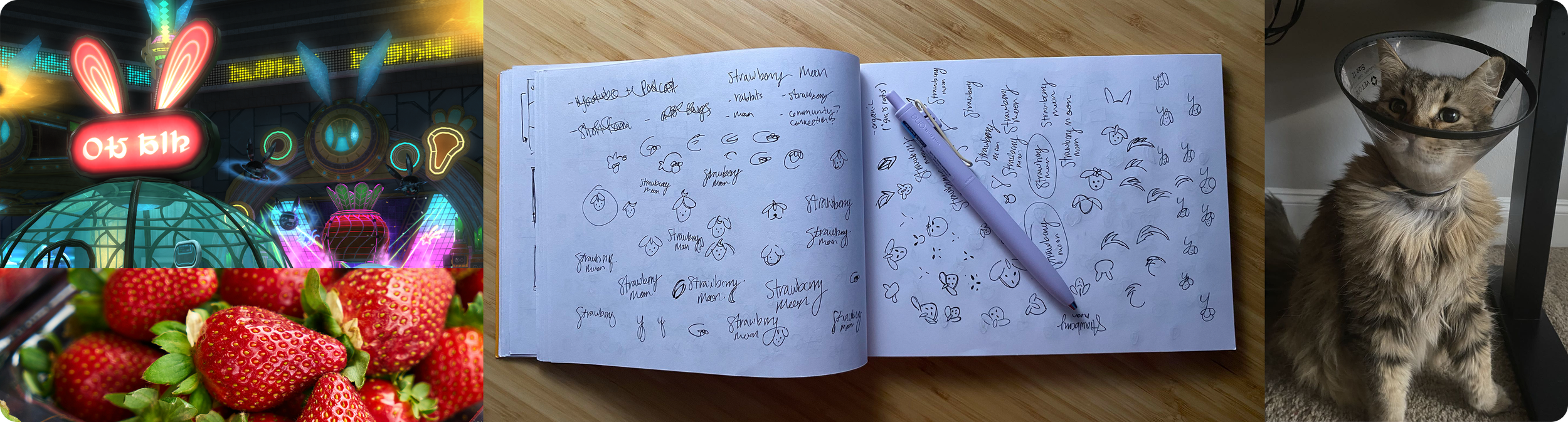
Discovery
The rabbit motif draws from Asian folklore, where rabbits are associated with the moon, a reference the game also uses as a plot point. Rather than a literal interpretation of the name, I wanted a mark where the elements worked together naturally. One idea I pursued was using strawberry seeds to form a face, inspired by a similar treatment on a rabbit robot character in the game. Incorporating a crescent moon shape proved to be the most persistent challenge across many iterations until an unexpected source of inspiration emerged: a silly photo that I took of my cat wearing a veterinary cone. The way his ears poked out from the top gave me an idea for a solution I needed, and the direction became clear from there.
Execution
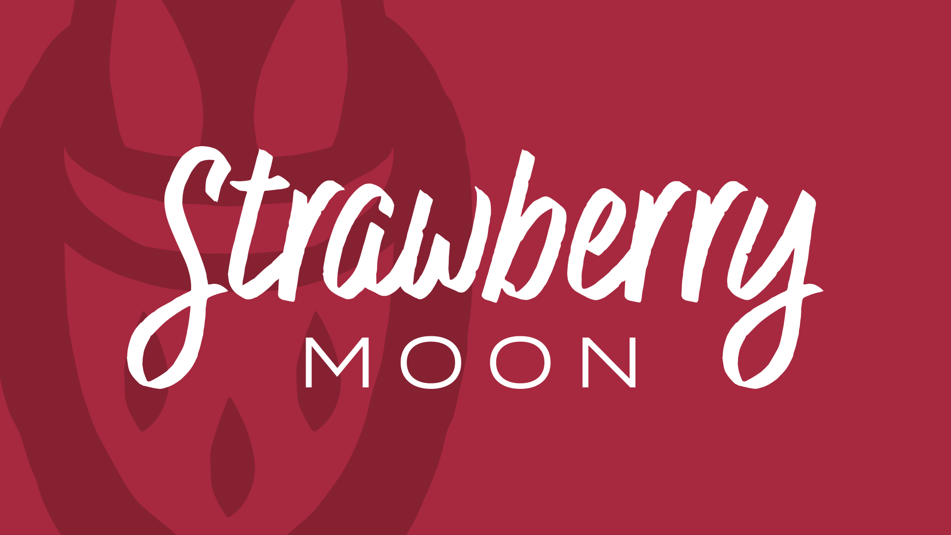
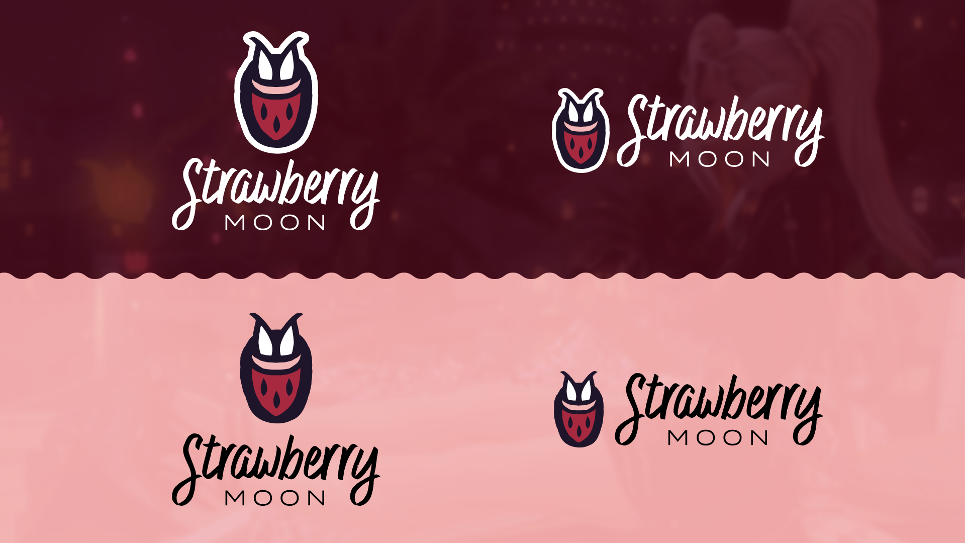
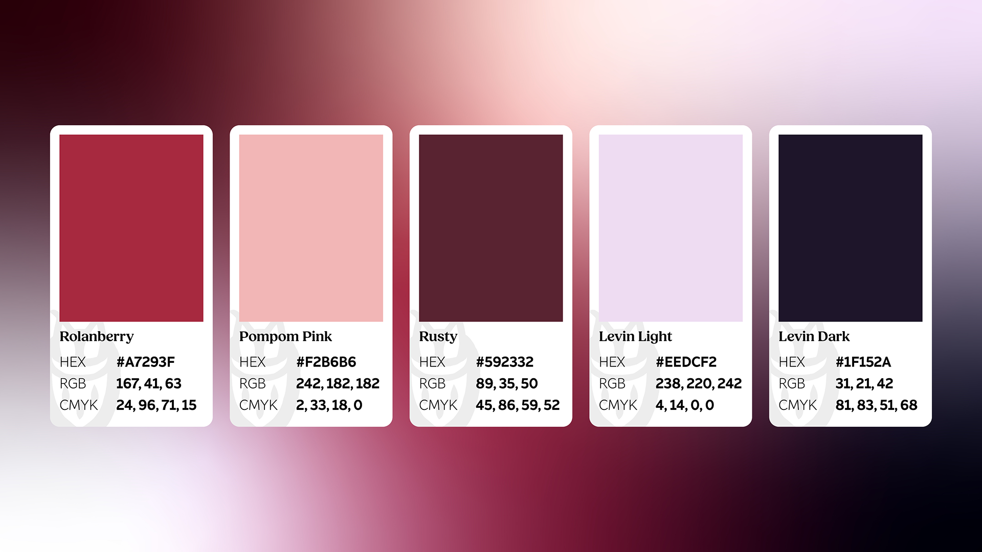
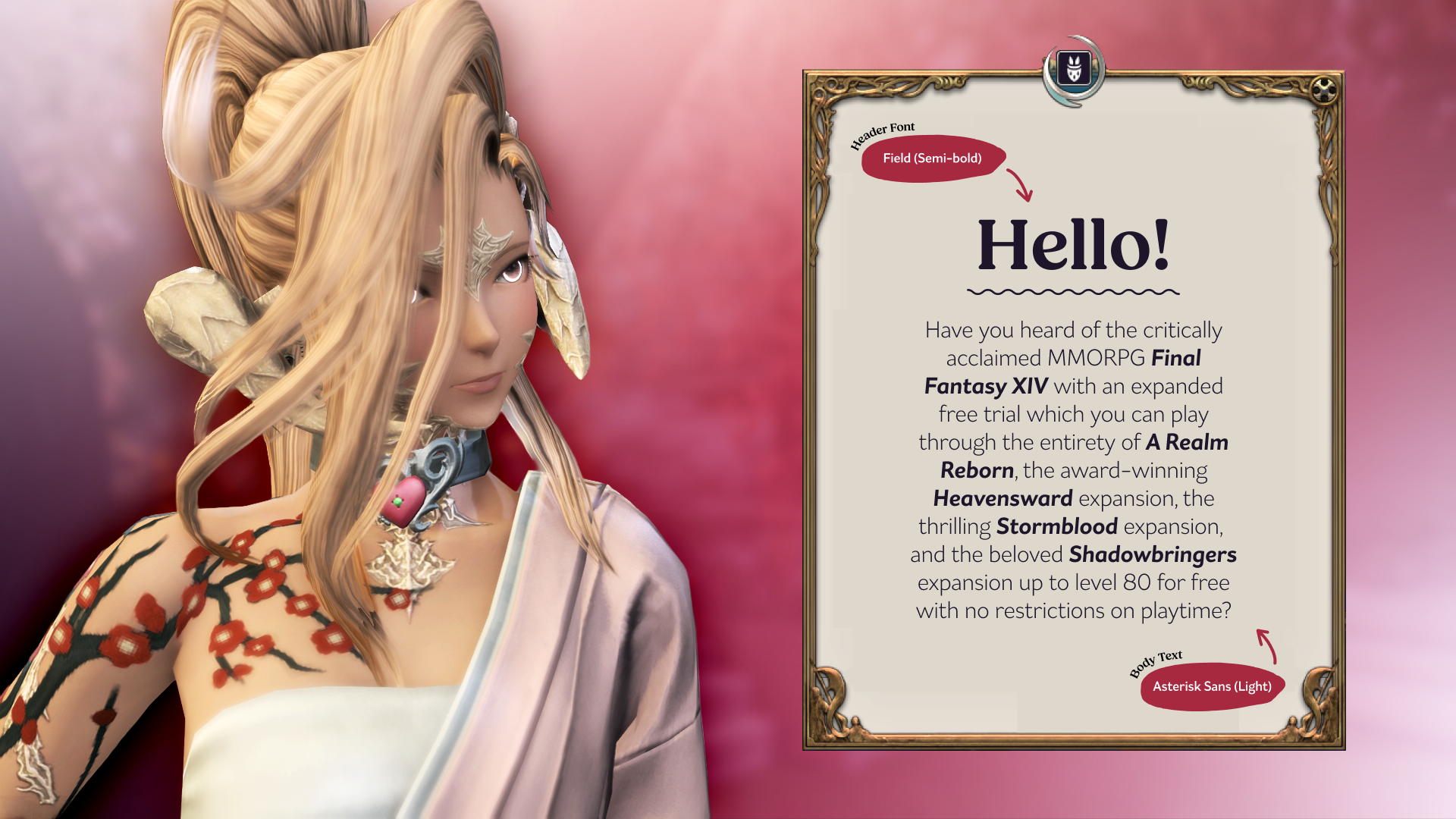
The logotype was based on a handwritten-styled font and modified for balance while retaining its organic form. The color palette and dream-like gradient draw from the phenomenon itself, centering on warm strawberry tones against the night sky.
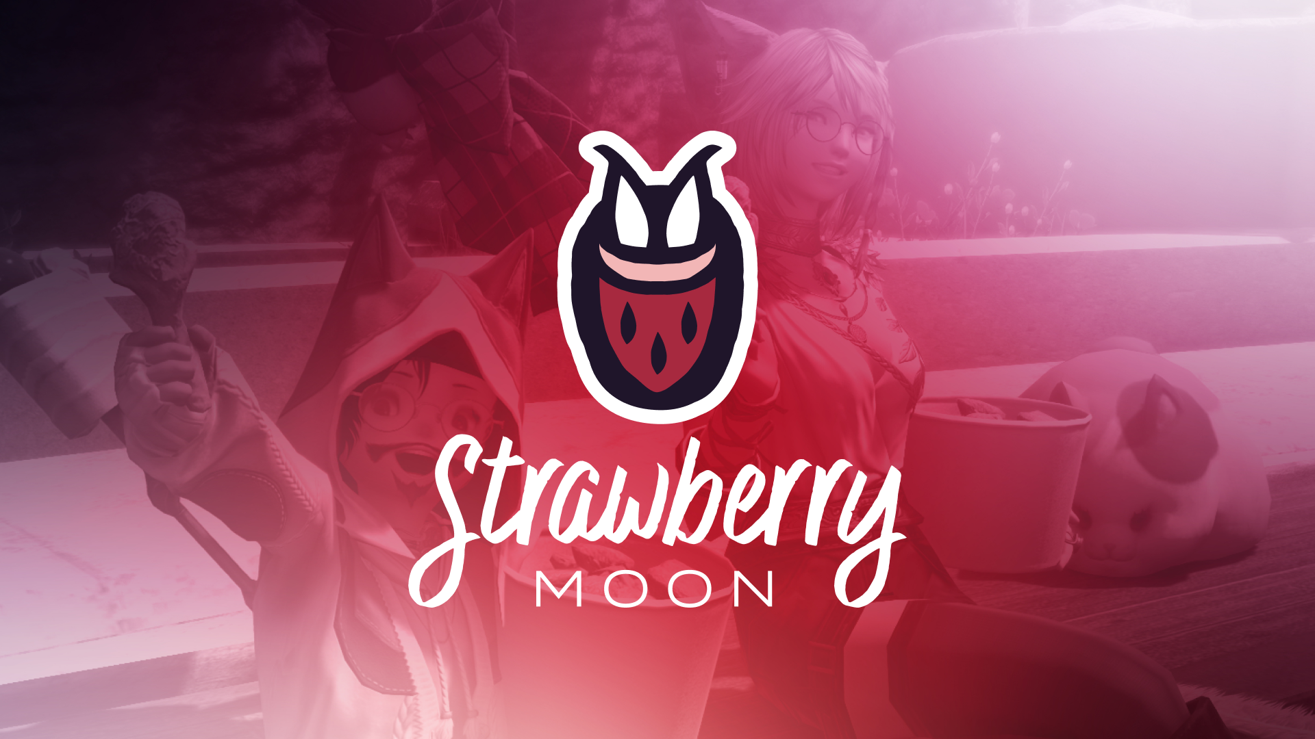
The logomark is open to interpretation. The primary reading is a strawberry-like rabbit head, but it has also been read as a rabbit hiding in a strawberry-styled pocket or as a rabbit wearing a strawberry mask. Rather than treating this as ambiguity, the multiple readings felt appropriate for a community-related project, where different members come together and bring their own perspectives and personalities.